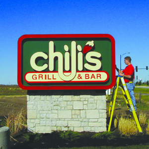
One of the things customers will notice when they first visit a business is the signs, directing them to where they need to go. It might not be something that businesses pay the most attention to, but way-finding and destination signage are markers your customers will rely on when navigating your business campus.
Here are five strategies you should consider when developing your exterior signage.
1. Make Signs Self-Navigable and Intuitive. Make sure your signage gives a brief and clear path to follow. If it’s a primary directional sign, never give more than five (5) choices for the pedestrian and/or driver. Keep it simple and clean. 2. Ensure Visibility. Make sure your signs are large enough to read. That might be obvious, but be sure to keep an eye on this over time. Has landscaping grown over some signs? Has paint faded making once clear signs hard to see? Or have you renovated, making old signs obsolete?
 3. Help the Pedestrian/Driver. Provide a decision wherever a decision needs to be made. You may have told people 300 feet ago that the entrance was straight ahead, but they might have forgotten by the time they reach the stop sign. Keep them on the right path and reaffirm that they’re headed the right way.
4. Avoid Company Jargon. You might know what the FLC is or that Entrance 3 is the main door. However, a customer may not know these details. Call it what it is: Main Entrance, Customer Service, Shipping and Receiving, etc.
5. Follow the Rules. When it comes to outdoor signage, you will need to navigate the regulation waters of your town, city, county, neighborhood, and more. You'll be held responsible for following the regulations for sign materials: lighting, legibility, height, distance from road, and ADA accessibility. Work with your sign company and attend a town planning meeting to ensure you have the proper permits and follow the rules for your signage.
Tags
Subscribe to Parvin-Clauss's Blog


Comments